
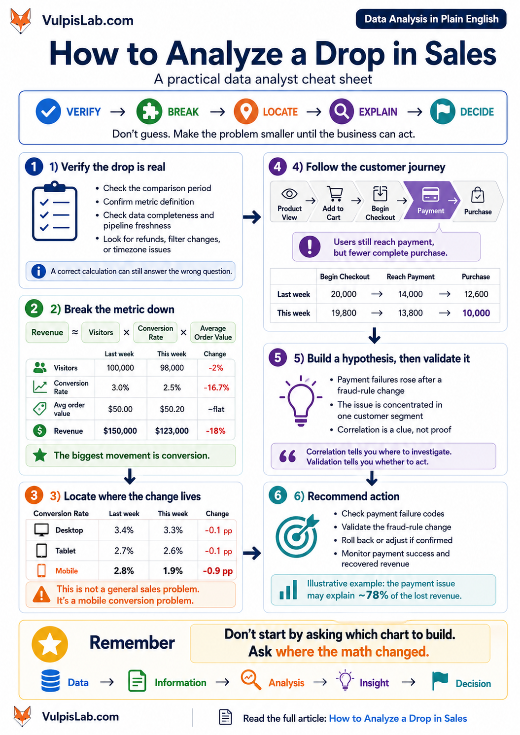
If you want to know how to analyze a drop in sales, don’t begin with SQL, Excel, or a dashboard. First confirm that the drop is real, break sales into the smaller numbers that create it, find where the change is concentrated, and then investigate what could have caused it.
Imagine this is the only message waiting for you on Monday morning:
“Sales are down 18%. Can you find out what happened?”
That’s it.
No one tells you which table to query.
No one tells you which chart to build.
And nobody knows whether the problem is marketing, pricing, the website, payments, customers, or the data itself.
This is where data analysis becomes interesting.
Because calculating an 18% drop is easy.
Finding out why it happened without fooling yourself is the real job.
For this investigation, remember one VulpisLab mental model:
VERIFY → BREAK → LOCATE → EXPLAIN → DECIDE
Let’s use it.
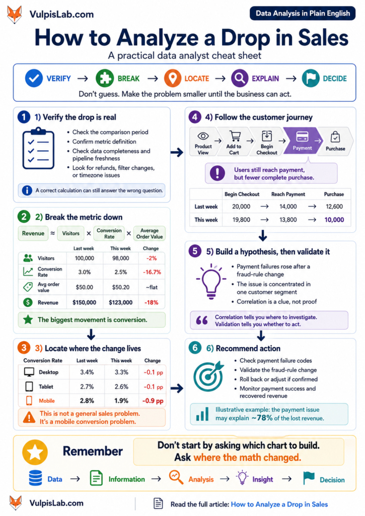
Monday, 9:12 AM: Sales Are Down
Suppose we run an online coffee business selling coffee bags and monthly subscriptions.
Last week, revenue was approximately:
$150,000
This week:
$123,000
The difference is $27,000.
That’s an 18% decline.
Almost immediately, theories appear.
Marketing says:
“Traffic probably dropped.”
Product says:
“The new mobile design may have hurt conversion.”
Finance asks whether refunds increased.
Someone mentions a competitor’s weekend discount.
Every explanation is possible.
None of them is evidence.
That distinction is important.
An explanation that sounds reasonable is still only a hypothesis until the data supports it.
Before Asking Why, Ask Whether the Number Is Real
Imagine spending six hours investigating a sales decline only to discover that today’s data pipeline hadn’t finished loading.
It sounds embarrassing.
It also happens.
Before analysing why sales dropped, verify that sales actually dropped.
Check things such as:
Is the current period complete?
Are we comparing seven days with seven days?
Did the timezone change?
Are refunds included consistently?
Did someone change a dashboard filter?
Has the definition of revenue changed?
Did an ingestion job fail?
Were some orders duplicated last week?
Suppose today is Sunday afternoon and this week’s dashboard contains only six and a half days of transactions.
The dashboard may be technically correct.
Your interpretation would not be.
That’s one of the most important habits in analytics:
A correct calculation can still answer the wrong question.
In our coffee-store case, the analyst checks the order database, payment totals, reporting period, and pipeline status.
Nothing unusual appears.
The $27,000 gap is real.
Now we can investigate.
[Internal link opportunity: Before You Analyse Anything, Check Whether the Data Is Lying]
Don’t Stare at Revenue. Break It.
“Revenue is down” is too large a problem.
We need to make it smaller.
For a simple online store, one useful starting model is:
Revenue = Orders × Average Order Value
Orders can be broken further:
Orders ≈ Visitors × Conversion Rate
That gives us:
Revenue ≈ Visitors × Conversion Rate × Average Order Value
This isn’t a universal revenue formula. A subscription company, marketplace, bank, or SaaS business may require a different decomposition.
But it works well for our illustrative coffee store.
Now let’s compare the numbers.
| Metric | Last week | This week | Change |
|---|---|---|---|
| Visitors | 100,000 | 98,000 | -2% |
| Conversion rate | 3.0% | 2.5% | -16.7% |
| Average order value | $50.00 | $50.20 | roughly flat |
| Revenue | $150,000 | $122,990 | about -18% |
These are illustrative numbers created for this example, not production benchmarks.
But notice what they do to the investigation.
Traffic fell slightly.
Average order value barely moved.
Conversion fell dramatically.
We’ve transformed:
Why did sales fall 18%?
into:
Why are fewer visitors becoming customers?
We still don’t know the answer.
But we know where to look.
That is progress.
Analysis Is Often About Eliminating Wrong Explanations
At the start, almost anything could have caused the decline.
(1)Maybe fewer people visited.
(2) Maybe customers bought cheaper products.
(3) Maybe prices changed.
(4) Maybe a major product went out of stock.
(5) Maybe checkout broke.
(6)Maybe payments failed.
(7) Maybe the customer mix changed.
The first analysis eliminated several possibilities.
Traffic alone cannot explain an 18% revenue decline.
Average order value cannot explain it either.
Conversion can.
A useful way to think about analytical work is:
Every good question should make the mystery smaller.
This is why the first question matters so much.
[Internal link opportunity: How to Turn a Vague Business Problem Into Data Questions]
The Overall Conversion Rate Has Done Its Job
We now know conversion fell.
But where?
Looking at the overall conversion rate again won’t help.
So we segment it.
We could investigate conversion by:
device,
traffic source,
country,
new versus returning customer,
product category,
customer type.
Not because analysts should create every possible breakdown.
That quickly turns into chart-making without thinking.
We’re asking one specific question:
Is conversion falling everywhere, or is one group responsible for most of the change?
Suppose the device analysis shows this:
| Device | Previous conversion | Current conversion |
|---|---|---|
| Desktop | 3.4% | 3.3% |
| Tablet | 2.7% | 2.6% |
| Mobile | 2.8% | 1.9% |
Now the story changes.
Desktop is almost unchanged.
Tablet is almost unchanged.
Mobile has fallen sharply.
And suppose mobile represents about 70% of traffic.
We don’t really have a company-wide conversion problem anymore.
We have something much more specific:
Mobile visitors have suddenly become much less likely to purchase.
The average was hiding that.
[Internal link opportunity: The Average Customer Does Not Exist]
Now SQL Has a Job
Notice when SQL entered this story.
Not at the beginning.
Only after we had a question worth asking.
Perhaps our data contains sessions, device types, orders, and timestamps.
We might run something like:
SELECT
    device_type,
    COUNT(DISTINCT session_id) AS sessions,
    COUNT(DISTINCT order_id) AS orders,
    COUNT(DISTINCT order_id) * 1.0
        / COUNT(DISTINCT session_id) AS conversion_rate
FROM sales_activity
WHERE activity_date >= CURRENT_DATE - INTERVAL '14 days'
GROUP BY device_type;
The exact query will depend on your schema, SQL engine, metric definitions, and data grain.
But the important part is not the syntax.
It is the question behind it:
How does conversion differ by device?
PostgreSQL describes aggregate functions as calculations that produce a result from multiple input rows; grouping lets us calculate those results for different groups. That’s exactly what we’re doing here: turning thousands of individual sessions into device-level evidence.
PostgreSQL aggregate-function documentation
SQL did not decide what to investigate.
We did.
SQL helped us answer it.
[Internal link opportunity: SQL Is Not the Hard Part. Knowing What Query to Write Is.]
Mobile Conversion Fell. We Still Don’t Know Why.
This is where a common analytical mistake appears.
Someone sees:
Mobile conversion ↓
and concludes:
The mobile website is bad.
Maybe.
But the data hasn’t proved that.
We need to make the problem smaller again.
Think about the purchase journey:
Product view → Add to cart → Begin checkout → Add payment details → Purchase
Now ask:
Where are mobile users disappearing?
Google Analytics uses the same funnel idea for ecommerce journeys. Its purchase journey tracks stages such as viewing a product, adding it to the cart, beginning checkout, and purchasing; its checkout journey can further examine payment and shipping stages.
Google Analytics funnel exploration guidance
Let’s apply that reasoning.
Suppose mobile checkout looked like this last week:
20,000 begin checkout
↓
14,000 reach payment
↓
12,600 purchase
This week:
19,800 begin checkout
↓
13,800 reach payment
↓
10,000 purchase
Something interesting just happened.
People are still reaching checkout.
They are still getting to payment.
But many more fail to become purchases.
This no longer looks primarily like a traffic problem.
It doesn’t even look like a general mobile usability problem.
The biggest break appears very late in the journey.
[Internal link opportunity: Conversion Fell. Where Are Users Actually Disappearing?]
2:30 PM: Check the Payments
The analyst asks for payment-attempt data.
Now another clue appears.
Suppose payment success was normally around 94%.
After Friday evening it fell to 82% for a particular segment of mobile customers.
That could explain a substantial amount of lost revenue.
And Friday afternoon, the fraud team changed one of its fraud-prevention rules.
Now we have something worth investigating.
But be careful with the language.
Bad analysis says:
“The fraud rule caused the sales decline.”
Good analysis says:
“Payment failures increased shortly after the fraud-rule change, and the increase is concentrated in the affected customer segment. The rule is now a strong hypothesis that should be validated.”
Why the caution?
Because payments can fail for several reasons.
Stripe’s payment documentation, for example, distinguishes issuer declines, blocked payments, and invalid API calls. Stripe also recommends tracking decline rates over time because changes can expose fraud or integration issues.
Stripe payment-decline documentation
Its acceptance analytics makes another useful distinction: some payment attempts fail before they reach the card network, while others reach the network and are declined by an issuer. Stripe separately measures payment success rate and network authorization rate for this reason.
Stripe acceptance analytics documentation
That’s a useful real-world lesson.
A customer can:
want your product,
add it to the cart,
enter checkout,
enter payment information,
and still never become revenue.
If the analyst looks only at traffic and purchases, a payment failure can masquerade as weak customer demand.
What Goes Wrong If We Stop Too Early?
Go back to the beginning.
Sales dropped 18%.
The marketing team believes traffic is the problem.
Suppose nobody investigates further.
The company launches a 20% discount campaign and increases advertising spend.
Traffic rises.
More people visit.
More people begin checkout.
But the payment problem remains.
Now the company has:
spent more money acquiring visitors,
reduced its margins through discounts,
and pushed even more customers into the broken part of the journey.
The dashboard may show traffic improving.
The actual constraint remains.
That’s why the purpose of analysis isn’t simply to recommend something.
It is to reduce the chance that the business takes the wrong action confidently.
Finding, Explanation, or Root Cause?
Let’s see how our investigation evolved.
Revenue fell 18%.
That’s an observation.
Conversion fell much more than traffic or average order value.
That’s a finding.
The conversion decline is concentrated on mobile.
Better finding.
The loss happens mostly between payment and completed purchase.
Now we’ve localised the problem.
Payment failures increased immediately after a fraud-rule change and are concentrated in customers affected by that rule.
Now we have a strong explanatory hypothesis.
But we still have one final analytical question:
How much of the 18% decline does this actually explain?
Quantify the Explanation
The business lost approximately:
$27,000
in weekly revenue.
Suppose transactions associated with the payment issue account for roughly:
$21,000
of that decline.
Then:
$21,000 ÷ $27,000 ≈ 78%
In this illustrative example, the suspected payment issue could explain about 78% of the missing revenue.
That is much more useful than simply saying:
“Payments look bad.”
There is still another 22% to understand.
Traffic fell slightly.
Other customer segments may have changed.
Normal variation exists.
But leadership now knows where the majority of the impact appears to be concentrated.
This helps prioritisation.
Not every change deserves equal investigation time.
Did the Fraud Rule Really Cause the Drop?
We still haven’t proven it.
The timing is suspicious.
The affected customer segment is suspicious.
The payment data strengthens the case.
But several things might have changed on Friday.
Perhaps the payment provider changed authentication behaviour.
Maybe an issuing bank had an incident.
Maybe a mobile release introduced an integration bug at approximately the same time.
So we need another round of validation.
Compare customers affected by the new rule with those who were not.
Compare approval rates before and after the change.
Check the exact payment failure codes.
Review application and payment logs.
If operationally safe, observe what happens when the suspected rule is corrected or rolled back.
This gives us another useful analyst rule:
Correlation tells you where to investigate. Validation tells you whether you should act.
[Internal link opportunity: Customers Using Feature X Retain Better. Did Feature X Cause It?]
The Recommendation Should Be as Specific as the Evidence
Imagine finishing this investigation with:
“Mobile conversion is low. Improve the mobile experience.”
It sounds professional.
It tells the team almost nothing.
A stronger recommendation would be:
Payment failures appear to explain most of the weekly revenue decline and rose immediately after the fraud-rule change. Validate the affected rule and failure codes, correct or roll back the rule if confirmed, and monitor mobile payment success and recovered revenue after the change.
Now the recommendation has:
a suspected mechanism,
an affected population,
a specific action,
and a measurement plan.
The analysis has crossed the gap between interesting information and something the business can use.
What Did the Analyst Actually Do?
Nothing magical.
We kept shrinking the question.
What changed?
Revenue.
Which part of revenue changed?
Conversion.
Where did conversion change?
Mobile.
Where in the mobile journey?
Payment to purchase.
What changed around payment?
Failure rate.
What changed around the same time?
A fraud rule.
How much of the revenue decline might it explain?
About 78% in our illustrative scenario.
That’s our original mental model again:
VERIFY → BREAK → LOCATE → EXPLAIN → DECIDE
The same thinking works outside sales.
Churn suddenly rises.
Delivery times worsen.
Cloud costs jump.
Loan defaults increase.
Customer complaints double.
Product activation falls.
Support tickets spike.
You don’t begin by throwing every metric into a dashboard.
You make the problem smaller.
Reporting Is Not the Same as Analysis
Look at the difference.
Data
Revenue = $123,000.
Information
Revenue fell 18%.
Analysis
The decline is mainly driven by mobile conversion.
Insight
Mobile customers continue reaching payment, but payment success deteriorated after a fraud-rule change.
Decision
Validate and correct the affected payment rule and measure whether payment success and revenue recover.
A dashboard is excellent at showing the first two.
The analyst earns their value by helping the organisation reach the last three.
How This Question Appears in a Data Analyst Interview
You may hear:
“Sales dropped 20% last month. How would you investigate?”
Do not rush into:
“I’ll query the sales table with SQL.”
Start with reasoning.
Confirm what “sales” means.
Confirm the time period and comparison.
Verify the data.
Break the metric into drivers.
Find which driver changed.
Segment the problem.
Follow the relevant customer or operational journey.
Develop hypotheses from evidence.
Validate the strongest one.
Quantify its contribution.
Recommend an action and define what you would monitor next.
The interviewer may care about SQL.
But before SQL, they’re testing whether you know which question deserves a query.
Try the Investigation Yourself
Suppose the numbers had been different.
Traffic falls 25%.
Conversion improves.
Average order value improves.
Revenue still falls.
Would you start investigating the checkout?
Probably not.
Your investigation would move toward acquisition:
- Did paid campaigns stop?
- Did organic traffic fall?
- Did a referral partnership end?
- Did tracking break?
- Did traffic decline only in one country or channel?
Same headline:
Sales are down.
Completely different investigation.
That’s why analysts shouldn’t memorise a single checklist for every problem.
The structure stays consistent.
The questions change with the evidence.
FAQ
What is the first thing to check when sales drop?
First verify that the decline is real. Check the metric definition, comparison period, data completeness, refunds, filters, timestamps, and pipeline status before investigating business causes.
Which metrics should you analyze when sales decline?
For many online businesses, useful starting metrics include traffic, orders, conversion rate, average order value, refunds, and payment success. The exact metrics depend on how the business generates revenue.
How do you find the root cause of declining sales?
Break sales into its major drivers, identify which driver changed, segment the change, locate the affected part of the customer journey, form hypotheses, and validate the strongest explanation with additional evidence.
Can a dashboard explain why sales dropped?
Usually not by itself. A dashboard can show where a metric changed, but understanding why often requires segmentation, event-level data, operational logs, payment information, experiments, or other supporting evidence.
Does correlation prove what caused the sales decline?
No. Two changes occurring together create a hypothesis, not proof. Look for additional evidence through affected versus unaffected groups, before-and-after comparisons, logs, operational evidence, or controlled experiments.
Remember This When Sales Drop
If you remember only one thing about how to analyze a drop in sales, remember:
Don’t begin by asking which chart to build. Ask where the math changed.
Revenue led us to conversion.
Conversion led us to mobile.
Mobile led us to checkout.
Checkout led us to payments.
Payments led us to a testable business action.
That’s what useful data analysis does:
It turns a large, frightening problem into a smaller question the business can actually answer.
The next article in Data Analysis in Plain English tackles the skill that made this entire investigation possible:
How to Turn a Vague Business Problem Into Data Questions.